Back to work

Accessibility as a Design Constraint, Not an Audit

Contributing components, documentation, and cross-system icon governance to Comcast's next-generation employee-facing design system, where compliance was settled at exploration rather than at review.

Client Comcast (Frontline UX)
Duration March 2024 – October 2024
My Role Principal Experience Designer (contributor)
Team 1 design lead, 3 designers, accessibility team, Prism engineers
Platforms Web, iOS hybrid (Capacitor), iPadOS hybrid (Capacitor)
Key Deliverables Component design & documentation, iconography governance, cross-system usage rules

The problem

Celestial was roughly 20% complete when I joined, and the components that already existed sat at about 15% accessibility compliance.

Comcast was building Celestial to replace its legacy 360 products and unify every employee-facing tool (Xfinity App, Flex, TV, Web/Mobile Native, and all Celestial Spaces) into a single, cohesive design system. The vision was ambitious, but the system was behind. A massive backlog of components and patterns needed to be designed and documented. There was no structured process for creating, reviewing, or handing off components. And the teams consuming the system, multiple product Pods across the Celestial ecosystem, needed components that actually worked at scale across four breakpoints and three platforms.

The system had a foundation. What it needed was volume: components designed, documented, and made compliant fast enough for the product teams already waiting on them.

Celestial Design System ecosystem diagram showing Foundations feeding Web, TV, and Mobile, which in turn serve xfinity.com, Flex, and the Xfinity app
15→95% the team's accessibility compliance shift, legacy to new components
2 design systems my icon governance spanned (CDS and XDS)
4 breakpoints designed per component
3 platforms supported (Web, iOS, iPadOS)

My role

Think Company was brought in to staff the Celestial Design System (CDS) team. I joined after the system had been established and worked as a contributor: designing and refining components, producing the documentation that shipped with them, and authoring the governance that kept the icon library from sprawling across two design systems.

Every component I touched needed to work across four breakpoints (desktop, tablet horizontal, tablet vertical, and native mobile), spanning both web and native app experiences. The accessibility standard was the team's, and it was demanding: compliance was a requirement at exploration, not a checkbox at review.

Component Design & Documentation

Designed and documented components across all four breakpoints and three platforms. Each one shipped with anatomy, behavior specs, usage guidelines, accessibility requirements, and sticker sheets.

Icon Governance

Authored the iconography workflows connecting CDS to the Xfinity Design System, including the criteria for when creating a new icon is justified at all. That rule is what keeps a shared library from sprawling.

Accessibility in Practice

Worked with the accessibility team from the earliest stage of every component rather than sending finished work for review. Keyboard navigation, screen reader support, contrast, focus management, and touch targets were settled before visual design began.

Cross-Functional Collaboration

Worked closely with the CDS team, Prism (engineering counterpart), the accessibility team, and multiple product Pods consuming the system, ensuring every component met real-world needs.

The approach

Phase 1: Exploration & Ideation

Understand the ecosystem

Conducted research with designers across Celestial product teams to understand their pain points and component needs. Performed competitive analysis against industry-standard design systems. Collaborated with accessibility and engineering teams early to establish compliance requirements and technical feasibility before any design work began.

Phase 2: Design & Iteration

Build iteratively with cross-functional input

Created components through rapid iteration, incorporating feedback from the CDS team, Prism engineers, and the accessibility team at every stage. Conducted cross-functional validation to ensure components met the needs of all consuming product teams, not just the design system in isolation.

Phase 3: Delivery & Implementation

Document, hand off, and ensure adoption

Produced comprehensive documentation for every component: anatomy breakdowns, behavior specs, usage guidelines, accessibility requirements, and sticker sheets. Conducted post-sprint reviews with consuming Pods to ensure adoption readiness. Handed off completed components to Prism for integration into the shared UI kit.

Designing for every surface

Every component needed to work across four breakpoints and three platforms, and still feel like one cohesive system.

Celestial supports web, iOS hybrid (Capacitor), and iPadOS hybrid (Capacitor). That meant every component I designed had to account for desktop, tablet horizontal, tablet vertical, and native mobile contexts, each with its own interaction patterns, touch targets, and layout constraints.

This wasn't about simply making things responsive. Each breakpoint required intentional design decisions: how does a data table behave on a tablet held vertically versus horizontally? How do navigation patterns shift between web and native? The goal was consistency without rigidity. The system should feel unified, but each platform should feel native to its context.

Making accessibility non-negotiable

When I started, legacy components had roughly 15% accessibility compliance. That wasn't just a metric. It meant employees using these tools every day were working around interfaces that didn't work for them.

The team treated accessibility as a first-class design constraint rather than an afterthought. Components were designed in collaboration with the accessibility team from day one, not reviewed by them after the fact. Requirements for keyboard navigation, screen reader support, color contrast, focus management, and touch targets were settled before any visual design began, and I designed and documented my components to that standard.

By the end of the engagement, new and updated components had reached 95% compliance across the program. That number belongs to the team. What I'd point to in my own work is narrower and more durable: every component I documented carried its accessibility specification alongside its anatomy and behavior, so the requirement travelled with the component instead of living in someone's review notes.

"Accessibility isn't a feature. It's a design constraint that makes everything better."

Status indicator and status icon matrix showing seven semantic tones across small, large, filled, outline, default, and inverse variants

Where the system started

  • ~15% accessibility compliance on legacy components
  • Accessibility reviewed after design, not during
  • No structured requirements per component
  • Inconsistent keyboard and screen reader support
  • Compliance treated as optional cleanup

Where the team took it

  • 95% compliance across new and updated components
  • Accessibility team involved from exploration phase
  • Every component documented with accessibility specs
  • Keyboard navigation and focus management standardized
  • Compliance built into the repeatable workflow

Governing icons across two design systems

CDS didn't own its icons. It inherited them from the Xfinity Design System, and without rules that relationship produces sprawl in both directions.

XDS serves Comcast's consumer-facing marketing and shop experiences. CDS serves the internal tools employees use all day. Icons crossed between them through Comcast's Global Access Project (GAP) tool, so every request cleared an organizational boundary. I wrote the documentation that governed it: one workflow for product designers requesting an icon, another for CDS designers submitting upward into XDS.

The rule that mattered most was about restraint. A new icon is justified only after exhausting the existing XDS library, and only with a definitive use case. Without that, every team invents its own icon for the same concept and the shared library stops being shared. I wrote the same kind of boundary documentation for components, spelling out where Celestial deliberately diverges from XDS.

Building the process, not just the components

A design system is only as good as the process behind it, and documentation is where most systems quietly fail.

The CDS workflow ran on a repeatable sequence: exploration and competitive research first, iterative design with cross-functional feedback, comprehensive documentation as a non-negotiable deliverable, and structured handoffs to Prism with clear specifications. Every component I delivered included anatomy breakdowns, behavior specifications, usage guidelines, accessibility requirements, and sticker sheets for designer consumption.

Post-sprint reviews with the consuming Pods, the product teams actually using these components, closed the feedback loop between the design system team and the people relying on it, so the system wasn't being built in isolation.

Exploration & research

Every component started with competitive analysis, cross-team interviews, and accessibility/engineering feasibility reviews, before any pixels were pushed.

Iterative design

Rapid iteration cycles with feedback from CDS, Prism engineers, and accessibility at every stage. Cross-functional validation ensured real-world viability.

Documentation standard

Anatomy breakdowns, behavior specs, usage guidelines, accessibility requirements, and sticker sheets, delivered for every single component.

Structured handoffs

Clear specifications handed to Prism for integration into the shared UI kit. No ambiguity, no guesswork, no rework.

Pod feedback loops

Post-sprint reviews with consuming product teams closed the gap between what the design system offered and what teams actually needed.

Sustainable scale

The workflow was built to outlast any one person on it, documented well enough that a designer joining next quarter could follow it without being walked through.

Outcomes

Program outcomes

  • The team moved accessibility compliance from ~15% on legacy components to 95% across new and updated work
  • Accessibility entered at the exploration phase rather than at review
  • Documentation standards came to include keyboard, screen reader, and focus management specs

My contribution

  • Designed and documented components across 4 breakpoints and 3 platforms
  • Authored the iconography governance spanning CDS and XDS, including the criteria for justifying a new icon
  • Wrote component documentation codifying where CDS deliberately diverges from XDS
  • Delivered components to Prism for integration into the shared UI kit

Process impact

  • A repeatable workflow: research, design, document, review, hand off
  • Post-sprint reviews with consuming Pods closed the feedback loop
  • Structured design-to-development handoff reduced ambiguity and rework

Team impact

  • Close collaboration across design, accessibility, and engineering
  • Components adopted by product Pods across the ecosystem
  • Standards documented well enough to survive team turnover

What I learned

Celestial reinforced something I believe deeply: the best design system work is invisible. When it's working, teams don't think about the system. They just build with it. Getting there requires rigorous documentation, relentless accessibility standards, and a willingness to design the process as carefully as the components.

The accessibility work was the most meaningful part of it. I contributed to that effort rather than led it, but watching a program travel from 15% to 95% taught me the thing I've carried into every system since: compliance is cheap when it's a design constraint and expensive when it's an audit finding. The order of operations is the whole game.

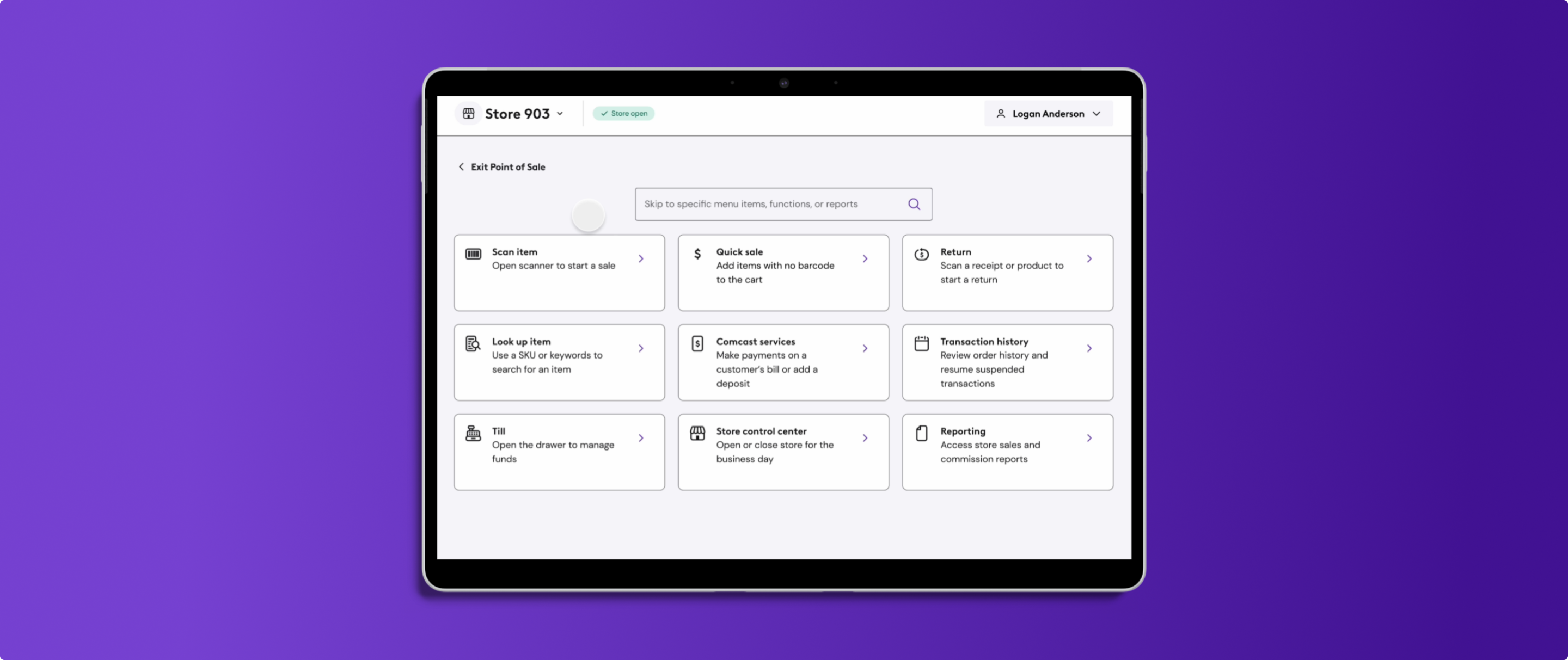
This project also set the stage for everything that came after. My knowledge of Celestial's architecture, components, and patterns became a major asset on the Point of Sale project, where I was specifically brought in because of that fluency. The systems thinking I sharpened here carried directly into the work I'd go on to lead at Meevo.

Continue reading

How this site was built

I'm going to say the quiet part out loud: AI built this website. And I'm proud of that.

Most people hide behind the fact that they use AI to create things. I want to flaunt it, because I think the way you use AI says more about you than whether you use it at all.

I've spent 16 years trying to deploy the portfolio website I always envisioned. I tried everything a non-coder could try: Webflow, Wix, Squarespace, literally just shipping a Figma prototype as my portfolio for the last few years. My most recent attempt had me deep in Framer, convinced I'd finally cracked it. Another unfinished project. The truth is, when you're working full time leading design teams, there's never enough time or energy left to also build and maintain your own site. The vision was always there. The bandwidth never was.

AI changed that equation entirely.

I designed every screen, every interaction, and every detail of this site in Figma, the same way I design everything. Then I used Claude Code to bring it to life, guiding it step by step through layout, styling, animation, and content. Every decision was mine. Every pixel was intentional. The AI was the tool that finally closed the gap between what I could envision and what I could ship.

But the site itself is just one output. The real unlock came from the way I've been working on projects like Meevo, building an AI-assisted design operations framework around markdown files, GitHub repositories, and context systems that keep multiple AI agents working with the most comprehensive understanding of the project possible. Over 18 months of leading that engagement, I accumulated a massive amount of project data: strategy documents, design rationale, stakeholder feedback, research findings, system documentation, the works.

So when it came time to write the case studies on this site, I didn't start from scratch. I pointed AI at all of that structured context and used it to help me aggregate, synthesize, and draft the narratives you're reading here. Because why wouldn't I? The craft is in the curation, the framing, and the judgment. The AI handles the grunt work that used to make case studies the thing designers never finish.

The result is the thing you're looking at right now, a portfolio that actually represents who I am, built the way I believe design should work. Not despite AI, but because of it.